标签搜索

搜索到
13
篇与
的结果
-
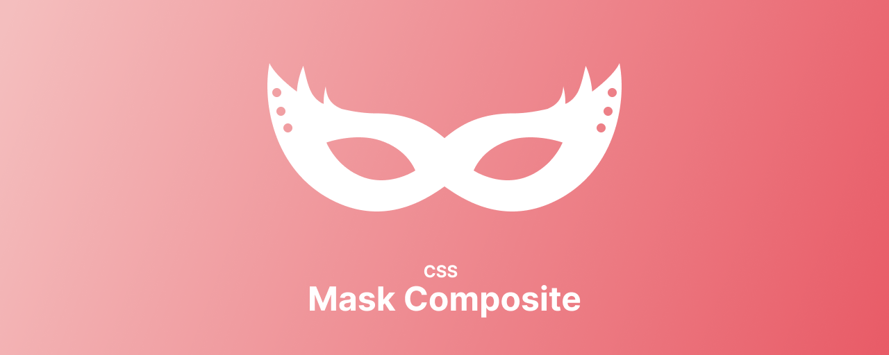
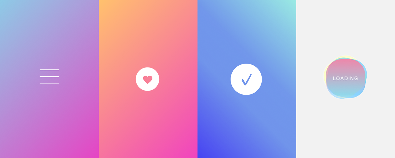
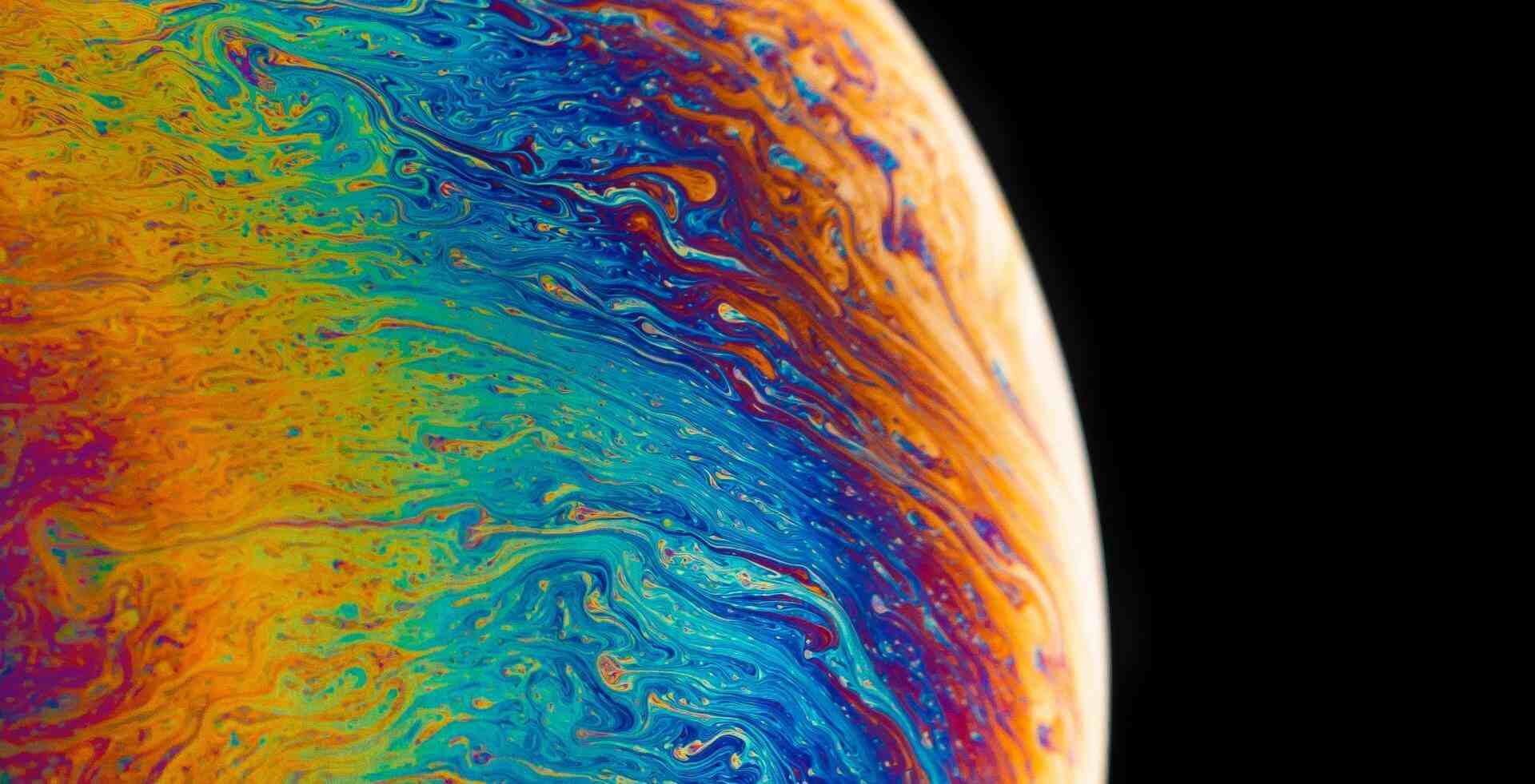
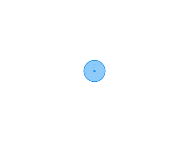 CSS新方法 mask-composite 属性对于使用 CSS 剪切 特定形状mask-image非常有用。通过使用属性将遮罩图像mask-image应用到元素,您可以仅遮罩该图像的不透明部分。mask-image自 2024 年起可用的属性mask-composite允许您指定如何合成掩码。mask-composite 属性的值与其 mask 结果之间的差异mask-composite该属性用于指定如何组合多个蒙版图像。事实上,mask-image属性还支持指定多个图像。从多个图像生成遮罩区域时,mask-composite您可以使用属性创建复杂的遮罩区域。background-image可以通过用逗号分隔来指定多个蒙版图像,就像多个属性一样。mask-image: url("mask1.png"), url("mask2.png");mask-sizemask-position也可以指定多个属性和属性。mask-image相应的值将按此顺序应用。/* 图片1 100px 100px 图像2 50px 50px */ mask-size: 100px 100px, 50px 50px; /* 图片位置*/ mask-position: 0 0, 50px 50px;mask-composite当多个蒙版图像像这样放置时,该属性决定了蒙版图像如何组合。mask-composite该属性有四个值:addsubtractintersectexclude默认值为add,它会添加每个区域。subtract从第一个遮罩图像中减去第二个遮罩图像。intersect遮罩区域是遮罩图像的重叠部分。遮罩区域是exclude遮罩图像的重叠区域以外的区域。下图将帮助您理解差异。根据遮罩图像和合成方法得出的遮罩区域结果mask-composite如果有三个或更多图像,可以使用多个属性来指定重叠程度,但会变得复杂。基本上,它是根据上面的遮罩图像以相反的顺序计算的(稍后描述)。例如,mask-composite假设您有三个遮罩图像和属性,如下所示。mask-image: url("mask1.png"), url("mask2.png"), url("mask3.png"); mask-composite: add, subtract;此时,我们是从上到下处理的,所以mask2.png首先我们将mask3.png和组合起来,然后将结果与组合起来。subtract mask1.png add注意兼容模式-webkit-mask-composite,2024年后可以不用写前缀。使用 mask-composite 构建蒙版现在将mask-composite介绍使用属性的蒙版组合的更实用的表现形式。中间切一个圆圈的面具通过使用中间带有黑色圆圈的遮罩图像,可以遮盖特定区域以外的部分,mask-composite: exclude这在过去是很困难的。这可以通过 HTML 和 CSS 来实现,如下所示<div class="centerHoleMask"></div>.centerHoleMask { mask-image: linear-gradient(#000, #000), url(".svg"); mask-repeat: no-repeat; mask-position: 0 0, center center; mask-size: 100% 100%, 480px 320px; mask-composite: exclude; }mask-image第一个属性值为linear-gradient(),用于屏蔽整个区域。第二个指定一个带有黑色中心的圆形蒙版图像。mask-composite: exclude从整体中除去中间圆形部分的区域成为遮罩。这种方法的优点是可以轻松适应屏幕尺寸的变化。以前,这是通过准备一个除中心之外填充不透明的图像来处理的,但是当屏幕比蒙版图像大时,某些部分无法正确蒙版,并且蒙版中孔的大小可能会改变。有很多限制,比如必须这样做。不过,通过这种方法,即使屏幕变大,也可以固定遮罩孔并扩大遮罩面积。使用蒙版的动画在某些情况下,单独为蒙版预先创建和排列这样的图像就足够了,但 CSS 蒙版的优点是可以用蒙版动画表达广泛的表情。使用交叉点的动画这是一个动画,其中两个图像流动,另一个图像显示在它们重叠的位置。<img src="/assets/images/bg.webp" class="intersectionAnimationImage intersectionAnimationImage1" /> <img src="/assets/images/bg2.webp" class="intersectionAnimationImage intersectionAnimationImage2" /> <img src="/assets/images/bg3.webp" class="intersectionAnimationImage intersectionAnimationImage3" />.intersectionAnimationImage { mask-repeat: no-repeat; animation-duration: 6s; animation-timing-function: linear; animation-iteration-count: infinite; } .intersectionAnimationImage1 { mask-image: url("/assets/images/intersection_mask1.png"); animation-name: intersection1; } .intersectionAnimationImage2 { mask-image: url("/assets/images/intersection_mask2.png"); animation-name: intersection2; } .intersectionAnimationImage3 { mask-image: url("/assets/images/intersection_mask1.png"), url("/assets/images/intersection_mask2.png"); mask-composite: intersect; animation-name: intersection3; } @keyframes intersection1 { 0% { mask-position: -1280px 0; } 100% { mask-position: 0 0; } } @keyframes intersection2 { 0% { mask-position: right -1280px bottom 0; } 100% { mask-position: right 0 bottom 0; } } @keyframes intersection3 { 0% { mask-position: -1280px 0, right -1280px bottom 0; } 100% { mask-position: 0 0, right 0 bottom 0; } }1图像和2图像使用单独的掩模图像进行流式传输,但交叉点处的3图像是两个掩模的合成。通过更改动画的关键帧mask-position,您可以移动蒙版位置并营造图像流动的印象。使用圆形蒙版的过渡表现一个使用转换的表现作为使用前面提到的圆形掩码的高级表现。<img src="/assets/images/bg.webp" /> <div class="transitionAnimationMask transitionAnimationMask1"></div> <div class="transitionAnimationMask transitionAnimationMask2"></div>.transitionAnimationMask { mask-image: linear-gradient(#000, #000), url("/assets/images/mask_circle.svg"); mask-repeat: no-repeat; mask-position: 0 0, center center; mask-size: 100% 100%, 0 0; mask-composite: exclude; animation-timing-function: var(--ease-out-quart); animation-fill-mode: forwards; } .transitionAnimationMask1 { animation-duration: 1s; animation-delay: 0.2s; &.isActive { animation-name: maskAnimation; } } .transitionAnimationMask2 { animation-duration: 1.1s; &.isActive { animation-name: maskAnimation; } } @keyframes maskAnimation { 0% { mask-size: 100% 100%, 0 0; } 100% { mask-size: 100% 100%, 800px 800px; } }两个蒙版图像放置在背景图像上方。通过对每个蒙版应用圆形蒙版并使用动画更改蒙版大小,可以创建一个使背景图像呈现圆形的表现。第一个和第二个动画的开始时间略有不同,持续时间也略有不同,从而产生一种扩展的过渡效果。与滚动相关的遮罩表现通过进一步应用过渡蒙版示例,我们将介绍与滚动相关的蒙版表现。这是一种看起来像是可以通过字母“GO”的字母O上的孔看到背景图像的表现。<div class="scrollMask"> <div class="scrollMaskInner"> <div class="wall"> <div class="wallMask"></div> <div class="text">GO</div> </div> <img class="wallImage" src="/assets/images/bg.webp" /> </div> </div>.wallMask { background-color: var(--color-primary); mask-image: linear-gradient(#000, #000), radial-gradient(#000 0, #000 50%, transparent 50%, transparent 100%); mask-repeat: no-repeat; mask-position: 0 0, 323px 237px; /* 「O」定位位置 */ mask-size: 100% 100%, 16px 18px; /* 「O」的size */ mask-composite: exclude; transform-origin: 331px 246px; /*「O」中心起点位置 */ }// 缩放大小 const ENOUGH_SCALE = 94; const scrollArea = document.querySelector(".scrollMask"); const wallMask = document.querySelector(".wallMask"); const text = document.querySelector(".text"); // 根据滚动事件更改缩放 scrollArea.addEventListener("scroll", (event) => { // 按滚动量放大 const scaleRatio = 1 + event.target.scrollTop / 11; if (event.target.scrollTop < 0) { return; } text.style.scale = `${scaleRatio}`; wallMask.style.scale = `${scaleRatio}`; // 当足够大时隐藏 if (scaleRatio > ENOUGH_SCALE) { wallMask.style.visibility = "hidden"; } else { wallMask.style.visibility = "visible"; } });蒙版和文本位置position: sticky是固定的,但请根据使用情况适当更改。
 -
has() CSS 新样式 2024 年浏览器可以使用 CSS 伪类 :has()。这个:has()伪类具有非常强大的潜力。这是:has()因为伪类允许您为任何关系指定选择器。:has() 伪类的基本用法:has()伪类通过传递给它的选择器来选择父元素。例:<p class="text"> <strong>隐约雷鸣</strong> 阴霾天空 但盼风雨来 能留你在此 </p> <p class="text">隐约雷鸣 阴霾天空 即使天无雨 我亦留此地</p>.text { color: #000; } .text:has(strong) { color: red; }由于第一个元素.text有标签,因此:has(strong)应用伪类,文本颜色变为红色。第二个.text元素没有标签,因此文本颜色保持黑色。就其本身而言,这只是父元素的选择器,但:has()伪类的真正强大之处在于它们允许您追溯到父元素,从而允许您编写超越 HTML 中的父子关系的选择器。在 JavaScript 中使用 has()当使用 Canvas 等进行绘制时,可以使用 JavaScript 来控制视觉变化。在这种情况下,您不仅可以在 CSS 中使用:has()伪类,还可以将其用作 JavaScript 函数的查询。querySelector()// 鼠标坐标 const mousePosition = { x: 0, y: 0 }; // 粒子默认值 const defualtSettings = { /* 省略 */ }; // 粒子设置 let particleSettings = { /* 省略 */ }; document.addEventListener("mousemove", (event) => { // 更新鼠标坐标并更改粒子位置 mousePosition.x = event.pageX; mousePosition.y = event.pageY; const isATagHovered = document.querySelector("body:has(a:hover)"); if (isATagHovered) { // 悬停时更改粒子设置 particleSettings = { ...defaultSettings, particleNum: 4, xVariance: 70, yVariance: 70, }; } else { // 否则返回默认设置 particleSettings = { ...defaultSettings }; } });:has()使用的好处是不需要为各个标签设置事件处理程序,mousemove悬停控制可以在事件内完成。在此示例中,与事件处理程序相比,使用标签:has()可能没有太大优势,但在处理复杂状态时,可能很难同时组合来自不同事件处理程序的处理。它将在处理复杂的 Canvas 表达式时展现出它的威力。
-
H5 手风琴式UI Elements 和Elements 非常适合实现手风琴 UI创建手风琴 UI 时使用元素和元素HTML 结构很简单。可以看到,从标签名称就可以理解其结构。如果您想创建手风琴所需的最小打开/关闭动作,则不需要 CSS;HTML 就足够了。<details> <summary>概要</summary> 详细内容 </details>添加CSS 样式优化接下来,我们将使用 CSS 更改外观。我们将使用以下图标创建一个手风琴 UI。<details class="js-details"> <summary class="js-summary"> <span class="summary_inner"> 标题标题 <span class="icon"></span> </span> </summary> <div class="content js-content"> <div class="content_inner"> 内容部分内容部分内容部分内容部分内容部分内容部分 </div> </div> </details>details { margin: 0 auto; width: 70%; summary { /* display: list-item;清除默认三角图标样式 */ display: block; .summary_inner { cursor: pointer; display: flex; flex-direction: row; justify-content: space-between; align-items: center; padding: 16px 24px; border: 1px solid #d2beff; font-weight: bold; color: #002255; .icon { display: block; position: relative; width: 24px; margin-left: 6px; flex-shrink: 0; transform-origin: center 43%; transition: transform 0.4s; &::before, &::after { content: ""; position: absolute; display: block; width: 15px; height: 3px; background-color: #7050ff; } &::before { left: 0; transform: rotate(45deg); } &::after { right: 0; transform: rotate(-45deg); } } } } summary::-webkit-details-marker { /* Safari中修改相应的值 */ display: none; } /* details 内不直接指定padding */ .content { overflow: hidden; background-color: #f0f2ff; &_inner { padding: 24px 48px; display: flex; flex-direction: column; gap: 16px; } } } /* 打开内容展示时 旋转三角哦图标 */ details[open] .icon { transform: rotate(180deg); }使用JS添加动画 优化展示效果通过单击或使用键盘来打开和关闭手风琴。这次,我们将使用标准浏览器功能Web Animations API来为手风琴的内容制作动画。<details class="js-details"> <summary class="js-summary"> <span class="summary_inner"> 标题标题标题标 <span class="icon"></span> </span> </summary> <div class="content js-content"> <div class="content_inner"> 内容部分内容部分内容部分内容部分内容部分内容部分 </div> </div> </details>details { margin: 10px auto; width: 70%; summary { /* display: list-item;清除默认三角图标样式 */ display: block; .summary_inner { cursor: pointer; display: flex; flex-direction: row; justify-content: space-between; align-items: center; padding: 16px 24px; border: 1px solid #d2beff; font-weight: bold; color: #002255; .icon { display: block; position: relative; width: 24px; margin-left: 6px; flex-shrink: 0; transform-origin: center 43%; transition: transform 0.4s; &::before, &::after { content: ""; position: absolute; display: block; width: 15px; height: 3px; background-color: #7050ff; } &::before { left: 0; transform: rotate(45deg); } &::after { right: 0; transform: rotate(-45deg); } } } } summary::-webkit-details-marker { /* Safari中修改相应的值 */ display: none; } /* details 内不直接指定padding */ .content { overflow: hidden; background-color: #f0f2ff; &_inner { padding: 24px 48px; display: flex; flex-direction: column; gap: 16px; } } } /* is-opened js控制类添加时展示 */ details.is-opened .icon { transform: rotate(180deg); }document.addEventListener("DOMContentLoaded", () => { setUpAccordion(); }); /** * JS 原生 (Web Animations API) animate() */ const setUpAccordion = () => { const details = document.querySelectorAll(".js-details"); const RUNNING_VALUE = "running"; // 动画运行添加属性值 const IS_OPENED_CLASS = "is-opened"; details.forEach((element) => { const summary = element.querySelector(".js-summary"); const content = element.querySelector(".js-content"); summary.addEventListener("click", (event) => { // 禁用默认行为 event.preventDefault(); // 防止连点, 动画执行时 点击无效 if (element.dataset.animStatus === RUNNING_VALUE) { return; } // 判断当前 details 的 open 属性 if (element.open) { // 关闭时操作 // 切换图标操作类 element.classList.toggle(IS_OPENED_CLASS); // 运行动画 const closingAnim = content.animate( closingAnimKeyframes(content), animTiming ); // 指定动画运行时 使用的值 element.dataset.animStatus = RUNNING_VALUE; // 手风琴 关闭后 closingAnim.onfinish = () => { // 删除自定义属性 open element.removeAttribute("open"); // 删除动画运行时的值 element.dataset.animStatus = ""; }; } else { //打开手风琴时的处理 //添加自定义 open属性 element.setAttribute("open", "true"); // 添加样式 element.classList.toggle(IS_OPENED_CLASS); // 执行打开动画 const openingAnim = content.animate( openingAnimKeyframes(content), animTiming ); // 赋值动画运行时 状态 element.dataset.animStatus = RUNNING_VALUE; // 动画运行完成后 置空 openingAnim.onfinish = () => { element.dataset.animStatus = ""; }; } }); }); }; /** * 动画 配置 */ const animTiming = { duration: 400, easing: "ease-out" }; /** * 关闭时的 关键帧 */ const closingAnimKeyframes = (content) => [ { height: content.offsetHeight + 'px', // height: "auto" 设置auto时 不能很好的计算 opacity: 1, }, { height: 0, opacity: 0, } ]; /** * 打开时 关键帧 */ const openingAnimKeyframes = (content) => [ { height: 0, opacity: 0, }, { height: content.offsetHeight + 'px', opacity: 1, } ]; 参考示例
-
CSS网格布局简介 网格布局使得创建网站布局比传统方法更容易,而且不会影响 HTML 元素的结构。它特别适合具有垂直轴和水平轴的网格状布局,而使用 Flexbox 很难创建这种布局。创建常用布局时了解网格布局的基础知识<div class="container"> <header class="header">header</header> <main class="main" >main</main> <aside class="aside" >aside</aside> <nav class="nav" >nav</nav> <footer class="footer">footer</footer> </div>使用 Flexbox 创建时使用 Flexbox 创建此布局时,通过用标签等包围要水平对齐的元素(aside、main、div、nav)来创建 Flex 容器div,并将要水平对齐的元素作为 Flex 项目放置。必须添加标签,这增加了一个额外的元素。使用网格布局创建时网格布局指定布局周围的容器元素(在我们的示例中.container)如何排列其子元素。与 Flexbox 不同,不需要准备用作排列元素的行/列容器的元素。我们将在解释网格布局的容器和项目的同时,使用 CSS 创建布局。网格容器创建网格容器以在网格布局中排列元素。指定一个元素display: grid使其成为网格容器。 (当将其视为内联元素时display: inline-grid指定).container { display: grid; }这仍然只是排列元素。因此,指定将网格容器划分为多个网格容器。垂直和水平分割网格容器。垂直划分的每列的大小由grid-template-columns水平划分的每行的大小grid-template-rows指定。让我们指定列宽。在此布局中,左侧边栏宽度为 180 像素,右侧边栏宽度为 160 像素。中央主区域的宽度是可变的,即父元素的宽度减去左右侧边栏的宽度。在这里,fr我们将使用该单位来指定主要区域的宽度。fr是一个单位,可用于指定划分网格容器的大小。从总宽度中减去指定的fr单位(px例如),并将剩余宽度fr分配给指定的列。flex-grow该图像类似于Flexbox属性。这次我想通过从整体宽度中减去左右侧边栏的宽度(180px、160px)来分配主区域的宽度,所以写如下。.container { display: grid; /* 从第一列开始 180px 1fr 160px */ grid-template-columns: 180px 1fr 160px; }以同样的方式指定每行的高度。.container { display: grid; /* 从第一列开始 180px 1fr 160px */ grid-template-columns: 180px 1fr 160px; /* 从第一行开始 60px 1fr 90px */ grid-template-rows: 60px 1fr 90px; }此时的列和行称为网格轨道。划分列和行的线称为网格线。设置每个元素所占格子放置网格项目。网格容器正下方的子元素称为网格项。在这种情况下,标题、主要内容、左右侧边栏和页脚都是网格项。划分网格轨道的网格线从第一行开始自动编号为 1、2、3 等。指定网格项将从哪一列放置到哪一条grid-column-start网格线grid-column-end。同样,grid-row-start使用grid-row-end和 指定从哪条网格线到哪条网格线放置。.header { /* 列的第一条到第四条网格线 */ grid-column-start: 1; grid-column-end: 4; /* 行的第一条到第二条网格线 */ grid-row-start: 1; grid-row-end: 2; }此时,如果grid-column-end指定,则会被放置在从每个指定grid-row-end的网格线到下一个网格线的范围内。.header { grid-column-start: 1; grid-column-end: 4; grid-row-start: 1; grid-row-end: auto; } .main { grid-column-start: 2; grid-column-end: auto; grid-row-start: 2; grid-row-end: auto; } .aside { grid-column-start: 1; grid-column-end: auto; grid-row-start: 2; grid-row-end: auto; } .nav { grid-column-start: 3; grid-column-end: auto; grid-row-start: 2; grid-row-end: auto; } .footer { grid-column-start: 1; grid-column-end: 4; grid-row-start: 3; grid-row-end: auto; }grid-column-start可以使用简写grid-column-end property来指定grid-column。在这种情况下,可以省略。//如果以指定 相邻格子的起点 可以设置该属性为 auto .header { grid-column-start: 1; grid-column-end: 4; grid-row-start: 1; grid-row-end: auto; } //简写 .header { grid-column: 1 / 4; grid-row: 1; }网格布局 平铺元素虽然可以使用 float 或 Flexbox 创建这种布局,但使用 Grid Layout 更方便的点.container { display: grid; /* 重复 最小100px、最大1fr 列 */ grid-template-columns: repeat( auto-fill, minmax(100px, 1fr) ); column-gap: 10px; row-gap: 10px; }
-
CSS属性 clip-path clip-path CSS 属性可以创建一个只有元素的部分区域可以显示的剪切区域。区域内的部分显示,区域外的隐藏。可以在 Clip-path 属性中指定范围之外的坐标。还支持范围外的坐标,例如小于0%的坐标和大于100%的坐标。通过指定范围外的坐标,可以用更少的坐标来表示。clip-path的属性值可以是以下几种:inset;将元素剪裁为一个矩形circle;将元素剪裁成一个圆ellipse;将元素剪裁成一个椭圆polygon;将元素剪裁成一个多边形指定超出范围值它还支持超出范围的值,如小于0%或大于100%的坐标。<div class="hexagon"></div>.hexagon { aspect-ratio: cos(30deg); inline-size: 180px; background-color: #313135; clip-path: polygon( -50% 50%, 50% 100%, 150% 50%, 50% 0 ); }
-
网页自定义Audio标签样式 audio 标签属性src:指定音频文件的URL。可以是本地文件路径或远程URL。autoplay:表示音频是否自动播放。如果设置这个属性,音频会在页面加载完成后立即开始播放。controls:显示浏览器内置的音频控件,如播放/暂停按钮、音量控制等。 controlsList="nodownload noplaybackrate" nodownload 不显示下载按钮 nofullscreen: 不要全屏按钮 noplaybackrate 不要播放速度按钮 noremoteplayback: 不要远程回放 disablePictureInPicture 禁止画中画按钮loop:指定音频是否循环播放。preload:指定音频在页面加载时的预加载行为。可选值有:none:不进行预加载。metadata:仅加载音频的元数据(比如时长、编码等)。auto:自动选择最合适的预加载方式。muted:表示音频是否静音。如果设置为true,音频将被静音。volume:指定音频的音量大小。取值范围为0.0到1.0之间。<div class="modal-audio"> <div v-if="audioSource" class="aiAudio-box"> <audio ref="audioPlayer" id="aiAudio" controls :muted="!isMuted" controlsList="nodownload noplaybackrate" @canplay="changeAudio($event,'allTime')" @timeupdate="changeAudio($event,'getCurrentTime')"> <source :src="audioSource" type="audio/mpeg"> </audio> <!-- 自定义 播放暂停 --> <span class="play-button" v-if="!isPlaying" @click="pauseAudio"></span> <span class="pause-button" v-else @click="playAudio"></span> <!-- 自定义 音量 静音 --> <span class="volume-button" v-if="isMuted" @click="toggleMute"></span> <span class="mute-button" v-else @click="toggleMute"></span> <!-- 自定义 时间 --> <span class="audio-time"> <!-- {{ currentTimeLabel + ' / ' + allTimeLabel }} --> </span> <!-- 自定义 进度条 --> <input type="range" class="audio-range" ref="audioPlayInput" step="0.01" :max="allTime" :value="currentTime" @change="changeAudio($event,'changeCurrentTime')" /> </div> </div>.modal-audio { padding: 20px 20px 0; display: flex; justify-content: center; .aiAudio-box { position: relative; #aiAudio { height: 50px; border: 1px solid #b292f4; border-radius: 40px; object-fit: initial; } .play-button, .pause-button { position: absolute; left: 13px; top: 11px; display: inline-block; width: 28px; height: 28px; background-size: cover; } .play-button { background-image: url("https://shthah.cn/audio/play.webp"); } .pause-button { background-image: url("https://shthah.cn/audio/pause.webp"); } .volume-button, .mute-button { position: absolute; left: 255px; top: 11px; display: inline-block; width: 28px; height: 28px; background-size: cover; } .volume-button { background-image: url("https://shthah.cn/audio/volume.webp"); } .mute-button { background-image: url("https://shthah.cn/audio/mute.webp"); } .audio-time { position: absolute; top: 14px; left: 48px; color: #454545; } .audio-range { position: absolute; top: 22px; left: 133px; width: 110px; } input[type="range"].audio-range { outline: none; -webkit-appearance: none; /*清除系统默认样式*/ background: -webkit-linear-gradient(#b292f4, #b292f4) no-repeat, rgba(0, 0, 0, 0.19); background-size: 0% 100%; /*设置左右宽度比例*/ height: 5px; border-radius: 5px; } /*拖动块的样式*/ input[type="range"]::-webkit-slider-thumb { -webkit-appearance: none; /*清除系统默认样式*/ height: 13px; width: 13px; background: #b292f4; border-radius: 50%; border: solid 1.5px #fff; } } audio::-webkit-media-controls-timeline-container, audio::-webkit-media-controls-seek-back-button, audio::-webkit-media-controls-seek-forward-button { background-color: #555; } // 整个音频控制面板的容器 audio::-webkit-media-controls-panel { background: #fcfbff; } // 静音按钮 audio::-webkit-media-controls-mute-button { background-image: none; } // 播放按钮 暂停 audio::-webkit-media-controls-play-button { background-image: none; } audio::-webkit-media-controls-pause-button { background-image: none; } // 包含时间轴的容器 audio::-webkit-media-controls-timeline-container { background-color: #b292f4; } // 当前播放时间显示 剩余播放时间显示 时间轴 audio::-webkit-media-controls-current-time-display, audio::-webkit-media-controls-time-remaining-display, audio::-webkit-media-controls-timeline { display: none; } }
-
CSS背景边框滚动效果 通过圆锥渐变设置背景,再控制背景旋转 <div class="container"> <a class="card-bg" href="#"></a> <a class="card" href="#"></a> </div>// 自定义渐变角度属性 @property --gradient-angle { syntax: "<angle>"; initial-value: 0turn; inherits: false; } .card { animation: 2s gradient-angle infinite linear; border: 2px solid transparent; background-image: linear-gradient(#584827, #2d230f), conic-gradient( from var(--gradient-angle), #584827 0%, #c7a03c 37%, #f9de90 30%, #c7a03c 33%, #584827 40%, #584827 50%, #c7a03c 77%, #f9de90 80%, #c7a03c 83%, #584827 90% ); background-clip: padding-box, border-box; background-origin: padding-box, border-box; } .card-bg { animation: 2s gradient-angle infinite linear; border: 2px solid transparent; background-image: conic-gradient( from var(--gradient-angle), #584827 0%, #c7a03c 37%, #f9de90 30%, #c7a03c 33%, #584827 40%, #584827 50%, #c7a03c 77%, #f9de90 80%, #c7a03c 83%, #584827 90% ); background-clip: border-box; background-origin: border-box; } @keyframes gradient-angle { to { --gradient-angle: 1turn; } } html, body { background: #141819; } .container { display: flex; justify-content: center; } .card,.card-bg { display: grid; min-width: 200px; margin:20px; padding: 20px; color: currentColor; border-radius: 20px; aspect-ratio: 1/1; }@property@property 是一个 CSS Houdini API,它允许开发人员定义自定义 CSS 属性。在你的例子中, --gradient-angle 可能是你想要定义的一个自定义渐变角度属性。通过使用 @property,你可以为这个属性指定类型、初始值等信息。你可以尝试下面这样定义 --gradient-angle 自定义属性:@property --gradient-angle { syntax: "<angle>"; inherits: false; initial-value: 0deg; }在这个示例中,我们定义了 --gradient-angle 的语法为 (表示一个角度值),不继承父元素的值,并且初始值为 0deg。在 CSS 中,@property 规则中的 syntax 值用于定义属性值的语法规则。以下是一些常见的 syntax 值::表示长度值,比如 px, em, rem 等。:表示百分比值,比如 50%, 100% 等。:表示颜色值,比如 red, #00ff00, rgba(255, 0, 0, 0.5) 等。:表示角度值,比如 0deg, 90deg, 180deg 等。:表示数字值,可以带小数点,比如 1, 2.5, -10.75 等。:表示字符串值,需要用引号括起来,比如 "Hello", 'World' 等。:表示 URL 值,比如 url('example.com/image.jpg').:表示自定义标识符(identifier),通常用于自定义属性名称。
-
CSS 动画-渐变段落-按钮边框 渐变段落<div style="background:#000"> <p class="text-flowLight"> 我是一段文字,看看看我的效果 </p> </div>.text-flowLight { position:relative; background-image:-webkit-linear-gradient(left,#1A3375,#b2c8ff,#1A3375 100%); -webkit-text-fill-color:transparent; -webkit-background-clip:text; -webkit-background-size:200% 100%; -webkit-animation:masked-animation 5s forwards linear infinite; font-weight:700; white-space:nowrap } @keyframes masked-animation { from { background-position:0 0 } to { background-position:-200% 0 } }按钮边框<div class="rabut"> <a href="###">炫酷边框特效</a> </div>body { background-color: black; } .rabut { width: 200px; height: 50px; color: #69ca62; /* 外面围绕的边框是真边框,眼睛看见的边框是阴影效果 */ box-shadow: inset 0 0 0 1px rgba(105, 202, 98, 0.5); background-color: #0f222b; } .rabut { text-align: center; margin: 100px auto; } .rabut, .rabut::before, .rabut::after { position: absolute; top: 0; bottom: 0; left: 0; right: 0; } .rabut::before, .rabut::after { content: ""; margin: -5%; box-shadow: inset 0 0 0 2px; animation: clipMe 8s linear infinite; } .rabut::before { animation-delay: -4s; } .rabut:hover::after, .rabut:hover::before { background-color: rgba(255, 0, 0, 0.3); } /* 核心:更改宽高后这下面的动画效果也需修改 */ @keyframes clipMe { 0%, 100% { /* 上 右 下 左*/ /* 上-下=-2px,右-右=220px 显示盒子上边框 */ clip: rect(0px, 220px, 2px, 0px); } 25% { /* 上-下=-70px,右-右=2px 显示盒子左边框 */ clip: rect(0px, 2px, 70px, 0px); } 50% { /* 上-下=-2px,右-右=220px 显示盒子下边框 */ clip: rect(68px, 220px, 70px, 0px); } 75% { /* 上-下=-70px,右-右=2px 显示盒子右边框 */ clip: rect(0px, 220px, 70px, 218px); } } .rabut a { font-size: 20px; line-height: 50px; text-decoration: none; color: #404d5b; }
-
CSS 实现漂亮的鼠标悬停效果 CSS Filter 是一种 CSS 功能,可让您获得模糊和颜色调整等图形效果只需指定您要应用的CSS属性filter的类型。例如,如果指定以下内容,则 HTML 元素将显示应用的效果。使用亮度的表现brightness()我们使用亮度调节方法。要使鼠标悬停在照片上时显得更亮,:hover只需为正常时间和时间设置不同的滤镜值,并使用 CSS Transition 添加动画即可。.effect-brightness { transition: filter 0.3s ease; filter: brightness( 1 ); /* 因为是默认值,所以可以省略这一行 */ } .effect-brightness:hover { filter: brightness(1.75); /* 添加亮度 */ }使用亮度的表现(闪烁)您只需更改 CSS 过渡即可创建各种变体。通过添加将鼠标悬停在其上方时瞬间闪烁的表情,可以给人一种轻快运动的印象。通过添加边框,可以给人留下鲜明的印象。transition生产的技巧是为正常时间和悬停时间指定不同的属性。.effect-flash { border: 1px solid rgba(255, 255, 255, 0%); filter: brightness(1.0); transition: filter 1s, border-color 1s ; } .effect-flash:hover { border: 1px solid rgba(255, 255, 255, 100%); transition: border-color 0.2s; animation: bright-flash 0.2s linear forwards; /* CSS Animation 动画。最后维持最终态 */ } @keyframes bright-flash { 0% { filter: brightness(2.5); } 100% { filter: brightness(1.25); } }使用饱和度一种将正常状态设置为单色并在鼠标悬停时取消单色的技术。通过将其设为单色,您可以用它来表达整体优雅的设计。这种表达对于化妆品和服装等品牌广告网站非常有用。.effect-mono { filter: grayscale(100); transition: filter 0.2s; } .effect-mono:hover { filter: grayscale(0); }使用亮度的表现(最适合按钮)brightness()此表达式非常适合具有多态设计的按钮。光滑的设计与亮度的变化相得益彰,单个按钮图像营造出漂亮的效果。即使设计者只提供普通的按钮图像,它也很有用,因为它很容易设置。.btn { filter: brightness(1); transition: filter 0.3s; } .btn:hover { filter: brightness(1.15); } .btn:active { filter: brightness(0.85); }使用模糊的表现一种当鼠标悬停时显示附加信息的技术。.effect-blur-thumb { transition: all 0.3s ease; width: 100%; } .effect-blur:hover .effect-blur-thumb { /* 悬停时调整亮度 */ filter: blur(8px) brightness(1.5); transform: scale(1.1); }
-
CSS动画实现 “关闭”的变形动画{collapse}{collapse-item label="代码实现" } .container-bg { background-image: linear-gradient(135deg, #8ecbe6, #e743c3); } .hm-line-top, .hm-line-middle, .hm-line-bottom { --height: 3px; display: block; width: 100%; height: var(--height); transition: 0.3s; transform-origin: center; background-color: #fff; position: absolute; top: calc(50% - var(--height) / 2); left: 0; } .hm-line-top { translate: 0 14px; } .hm-line-bottom { translate: 0 -14px; } .hm-button { position: relative; display: inline-flex; width: 48px; height: 48px; appearance: none; background: none; border: none; cursor: pointer; &.active { .hm-line-middle { opacity: 0; rotate: 90deg; } .hm-line-top { translate: 0 0; rotate: -135deg; } .hm-line-bottom { translate: 0 0; rotate: 135deg; } } } <div class="container container-bg"> <button class="hm-button" aria-label="开启"> <span class="hm-line-top"></span> <span class="hm-line-middle"></span> <span class="hm-line-bottom"></span> </button> </div> const button = document.querySelector(".hm-button"); button.addEventListener("click", () => { const current = button.classList.contains("active"); const next = !current; button.classList.toggle("active", next); button.setAttribute("aria-label", next ? "关闭" : "开启"); });{/collapse-item}{/collapse}圆形按钮悬停动画中心有图标的圆形按钮的悬停动画。心形随着旋转而改变颜色,背景圆圈变为透明的旋转虚线。{collapse}{collapse-item label="代码实现" } .content-bg-heart { background-image: linear-gradient(135deg, #ffc46e, #f043bf 100%); } .heart-button { position: relative; display: grid; width: 90px; height: 90px; cursor: pointer; place-items: center; appearance: none; border: none; background: none; user-select: none; &:hover { .heart-button-label { color: #fff; transform: rotate3d(0, 0, 0, 180deg) scale(1.2, 0.9); } .heart-button-back-inner { border: 1px dashed #fff; background-color: rgb(255 255 255 / 0); transform: scale(1.5); } } } .heart-button-label { position: relative; color: #f78198; font-size: 3rem; transform: scaleY(0.8); transition: 0.35s ease-in-out; line-height: 1; } .heart-button-back { position: absolute; width: 100%; height: 100%; animation: rotation 4s infinite linear; } .heart-button-back-inner { position: absolute; border: 2px solid #fff; width: 100%; height: 100%; border-radius: 50%; background-color: #fff; transition: 0.2s ease; top: 0; left: 0; box-sizing: border-box; } @keyframes rotation { from { transform: rotate(0deg); } to { transform: rotate(360deg); } } <section class="container content-bg-heart"> <button class="heart-button" > <span class="heart-button-back"> <span class="heart-button-back-inner"></span> </span> <span class="heart-button-label"></span> </button> </section>{/collapse-item}{/collapse}复选标记动画{collapse}{collapse-item label="代码实现"} .content-bg-check { background-image: linear-gradient( -135deg, #9cece3 0%, #7496ea 40%, #7393ea 60%, #4b3cf2 100% ); } .circle { position: relative; border-radius: 50%; width: 80px; height: 80px; box-shadow: inset 0 0 0 2px #fff; --ease-in-expo: cubic-bezier(0.95, 0.05, 0.795, 0.035); --ease-out-expo: cubic-bezier(0.19, 1, 0.22, 1); --circle-bg-color: #7393ea; &.animation { animation: circle-filling-animation 0.3s ease 1.2s forwards; .circle-cover-1::before { animation: circle-draw-animation 0.4s var(--ease-in-expo) 0.4s forwards; } .circle-cover-2::before { animation: circle-draw-animation 0.4s var(--ease-out-expo) 0.8s forwards; } .circle-illust { animation: circle-check-animation 0.9s 1.4s forwards; animation-timing-function: linear( 0, 1.32, 0.87, 1.05, 0.98, 1.01, 1, 1 ); } } } .circle-cover-1, .circle-cover-2 { position: absolute; overflow: hidden; width: 50%; height: 100%; &::before, &::before { position: absolute; content: ""; } } .circle-cover-1 { left: 50%; &:before { width: 100%; height: 200%; background: var(--circle-bg-color); transform-origin: 0 25%; } } .circle-cover-2::before { left: -10%; width: 110%; height: 120%; background: var(--circle-bg-color); transform-origin: 100% 40%; } .circle-illust { --size: 64px; position: absolute; width: var(--size); height: var(--size); color: var(--circle-bg-color); top: calc(50% - var(--size) / 2); left: calc(50% - var(--size) / 2); transform-origin: 50% 50%; opacity: 0; svg { width: 100%; height: 100%; } } @keyframes circle-draw-animation { 0% { transform: rotate(0deg); } 100% { transform: rotate(180deg); } } @keyframes circle-filling-animation { 0% { box-shadow: inset 0 0 0 9px #ffffff; } 100% { box-shadow: inset 0 0 0 50px #ffffff; } } @keyframes circle-check-animation { 0% { transform: scale(0) rotate(-10deg); opacity: 0; } 100% { transform: scale(1) rotate(0deg); opacity: 1; } } <div class="container content-bg-check"> <div class="circle animation"> <span class="circle-cover-1"></span> <span class="circle-cover-2"></span> <span class="circle-illust"> <svg viewBox="0 0 24 24" fill="none"> <path d="M9 16.2L4.8 12L3.4 13.4L9 19L21 7L19.6 5.6L9 16.2Z" fill="currentColor" /> </svg> </span> </div> </div> setInterval(() => { const el = document.querySelector(".circle"); el.classList.remove("animation"); setTimeout(() => { el.classList.add("animation"); }, 16); }, 4000);{/collapse-item}{/collapse}摇晃加载图标{collapse}{collapse-item label="代码实现" } .container-bg-loading { background-color: #f9f9f9; box-shadow: inset 0 0 0 1px #ddd; } .loading { position: relative; width: 100px; height: 100px; user-select: none; } .loading::after { border-radius: 40%; content: ""; display: block; width: 100%; height: 100%; background: linear-gradient( to bottom, #ee88aa, rgb(250 238 255 / 0.3) 90%, rgb(230 238 255 / 0.5) ); animation: loading-circle-opacity 3s infinite linear; } .loading-circle-1, .loading-circle-2, .loading-circle-3 { opacity: 0.4; position: absolute; background: #0af; /* 水色 */ width: 100px; height: 100px; transform-origin: 50% 47%; border-radius: 40%; animation: loading-circle-rotation 3s infinite linear; } .loading-circle-2 { opacity: 0.2; background: #ff0; /* 黄色 */ animation: loading-circle-rotation 5s infinite linear; } .loading-circle-3 { animation: loading-circle-rotation 2.5s infinite linear; } .loading-label { position: absolute; top: 33px; width: 100%; z-index: 1; color: #fff; text-align: center; font-size: 0.7rem; line-height: 2rem; letter-spacing: 0.15em; animation: loading-label-opacity 300ms infinite linear; } @keyframes loading-circle-rotation { from { rotate: 0deg; } to { rotate: 360deg; } } @keyframes loading-circle-opacity { 0% { opacity: 1; } 50% { opacity: 0.7; } } @keyframes loading-label-opacity { 0% { opacity: 1; } 25% { opacity: 0.8; } 50% { opacity: 0.9; } 75% { opacity: 0.6; } }<div class="container container-bg-loading"> <div class="loading"> <span class="loading-label">LOADING</span> <span class="loading-circle-1"></span> <span class="loading-circle-2"></span> <span class="loading-circle-3"></span> </div> </div>{/collapse-item}{/collapse}